I keep seeing everyone's post about this awesome act and can't help but post one myself. Unfortunately, I have not gotten to see Ovo, which looks amazing, but years ago I managed to see one of the other acts in Disney World.
In terms of being art, Cirque manages to cover many bases very well. For starters, the outside of almost all places holding their acts appear to be a giant circus tent of some sort. Many people know what takes place under these domes since they are the paradigm for circus location.
Another aspect well performed by Cirque is their music. Always live, the tunes change as the show progresses and vary from quiet and eerie to heroic and bold sounding. However, in order to not detract from the main subject of the show, the players are often hidden in some obscure manner from the audience. I specifically remember from Orlando that there was something that appeared to be a support beam but was actually hollow with players inside.
Of course the acrobatics of any cirque show are wildly impressive. From riding a unicycle on a wire that hovers high above the ground to juggling plates on strings, this show will have something that would regularly seem impossible to all non-acrobats. These acrobats are covered in costumes that often reflect the theme of the show, such as Ovo's insect theme. The costumes are usually brightly colored and tend to reflect on the festive and mildly humorous plays that are on display.
I definitely hope to see Ovo, as I missed the last show that was out. Good thing Christmas is coming up, maybe Santa can bring me some tickets.
And on that note, for anyone who reads this, I hope you have a great Holiday Break!
Thursday, December 9, 2010
Thursday, December 2, 2010
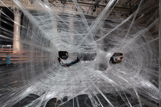
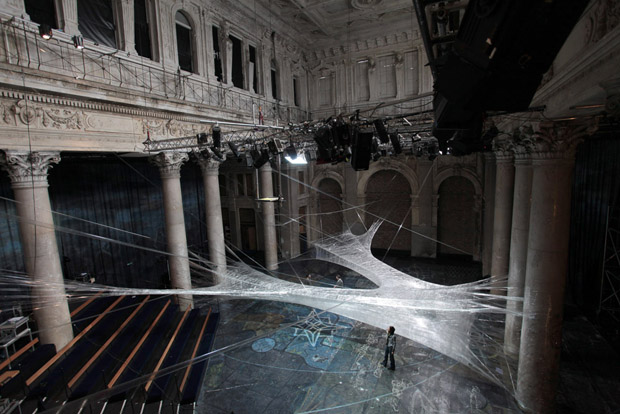
I might never be spider man, but...
In Vienna, there is a group of artists who make tunnels out of packing tape which bear a heavy resemblance to spider webs. This sort of public art seems very effective to me: not only is it wild to see but observers are allowed to explore the caverns the artists make. The original idea spawned from a Croatian gallery when a small number of designers were toying around with packing tape. The most recent installation took 100 pounds of tape, over 117000 feet of material!


Sunday, November 21, 2010
Dreamweaver Session and Project Progress
I really enjoyed the dreamweaver session last Tuesday. I have never gotten to use any sort of program that allows the construction of websites, nor did I understand how the remote data storage (or prism, I think?) worked. I had some difficulty keeping pace with the teacher, mostly since I wasn't sitting close enough to where she was speaking.
Today, one of my group members and I ventured out into Atlanta to get pictures of various art forms. The majority of our pictures were public art; however, I plan on going into some of the local museums and art stores to see what other art can be found near Tech.
I actually meant to make this post about the dreamweaver tutorial much earlier, and was reminded that I wanted to make one in the first place by this site:
http://people.rit.edu/~bss6378/instantCSI/
I am pretty sure I remember how to do at least that much from the lesson on Tuesday.
To any/all of my readers, have a Happy Thanksgiving (In case my next post is after Thursday).
Saturday, November 20, 2010
Art from out of this world.
This week there was a meteor shower Wednesday Evening around 3 Am, and I was quite excited about getting to see it. However, Atlanta's vast amount of light pollution cut any chance of being able to see the late-night wonder. I was left heartbroken, sleep-deprived (this one is normal, actually) and am now convinced that space itself owes me another shower for my own pleasure.
Even though I was unable to see the shower, I can always see pictures taken of other forms found in the heavens thanks to the Hubble Telescope. All the different forms of galaxies, planets, nebula and any of the other numerous objects the Hubble has managed to capture in its lens over the past few years are awe-inspiring and unlike anything else I have seen. My favorite pictures are probably those of the Nebulae, which have debris and materials in them that cause them to take many different shapes and colors.Whatever images I could post here would do no justice to the massive number of things the gallery of the Hubble has, be sure to take a look!
http://hubblesite.org/gallery/tours/
Sunday, November 14, 2010
To the Titian!
I really had no idea what to expect upon entering the High yesterday on my mission to see the Titian (Rhyme unintentional). Initially I was very perplexed by what the exhibit offered; I had expected nothing but a mass of awe-inspiring paintings and perfected artwork by great Victorian artists. Rather, the sketchings provided some insight as to how much work and effort goes into these grand works.
The majority of the pieces capitalized on religious figures from varying faiths and mythologies. My favorite theme in any of them, despite my lack of understanding in its importance, was how some of the important figures from the Christian paintings had small circles of some sort that resembled halos about their heads. I really am not sure why I found that so be so intriguing, and perhaps I will research not only the meaning behind the different types of circles but also the figures who were painted with them on.
My only complaints about this exhibit would possibly be the flooring and the lack of sound-proofing of any sort. It was really hard to reflect on a piece when all I can hear is CLIP CLOP CLIP CLOP CLIP CLOP and when there are art fanatics who are debating about who's opinion on a piece is more right. Otherwise, everything was fine.

Thursday, November 11, 2010
Huxley might've been right.
Nowadays, everything competes for our attention. Advertisements are everywhere, in the form of stickers, billboards, commercials, even clothing is covered in name brands that distract us from daily life. Video games take us to other worlds and get us painfully close to being in these alternate dimensions. Movies do about the same. Cellphones keep people chained to their social lives, allowing conversations to never end as, with a phone, the world is a mere sequence of numbers away. Humans on the whole have developed into a species that now preoccupies over being distracted. And with time, our tolerance for distractions grew. Ads needed to be flashier. Clothing needed to be edgier. Games need better graphics. Cellphones smaller. Make them play music, too.
And with this tolerance, some of the older distractions humans so readily used to interact with have been threatened, and they fall under the category of the Arts. The arts that one would commonly find in museums have tried to keep pace, however, even if it means losing some significance and dignity to their true audience. Museums are now constructed in odd shapes, to lure in more people. They are used to host public events, so as to fish out people who would possibly be interested in the art within. Like anything else that is living, art is adapting to the change in its environment, and hopefully, for the better.

And with this tolerance, some of the older distractions humans so readily used to interact with have been threatened, and they fall under the category of the Arts. The arts that one would commonly find in museums have tried to keep pace, however, even if it means losing some significance and dignity to their true audience. Museums are now constructed in odd shapes, to lure in more people. They are used to host public events, so as to fish out people who would possibly be interested in the art within. Like anything else that is living, art is adapting to the change in its environment, and hopefully, for the better.
Sunday, November 7, 2010
Quote from C.S. Lewis
After the original image we viewed from C.S. Lewis that had the text "This is not a pipe", I found a really neat quote from Lewis on the internet.
"You do not have a soul. You are a soul. You have a body."
I think this quote, along with the Pipe painting, go to show how anti-materialist Lewis is. Much of Lewis's other work is very religious and often focuses on the importance and strength of the human spirit, which I think is neat given that most intellectuals and philosophers of his day were often criticized heavily and rarely partook in religion.
To me, this quote shows how we as a race rarely consider the value of what makes us separate from the machine that is our own Earth. The soul is something that many people often neglect in order to please their physical and usually much more demanding form.
Monday, November 1, 2010
Atlanta High Museum
In Duncan's article on the effects behind a museums structure on an audience, he addresses how a museum should be "liminal", that is, should remove its audience from the monotony of everyday life and bring them to a point of peak spiritual and mental perception that grants the highest possible ability to enjoy the art that is on display. Many art museums have been crafted to stand out in their environments, and the High Museum in Atlanta is no exception.
 From my own personal experience with the High Museum I am willing to say that this building did a very good job of removing the shell of normality that can blur perception. Though the building is without color, the shape of the halls and stairwells gives the building a feeling of "flow" that visitors should follow by usually indirectly leading people in a certain path through the museum. Another benefit that the High has is that this grand example of architecture is mostly colorless. This lack of color prevents viewers from being distracted by the main pieces on display.
 One interesting point that Duncan reviewed in his essay was how art museums were often seen mimicking churches and schools, places that often contradicted or were against the purpose of an art museum. However contrasting these edifices may be in structure or audience, I find it neat that art museums copied the effects churches and basilicas have upon their visitors by using overwhelming architecture to awe people. Many churches use large arches and huge rooms to grant a feeling of smallness to religious followers, why not do the same to those who might not realize how insignificant they are to the important and deep world of art?


Thursday, October 28, 2010
Lighting, Also, nature again.
After so long in Atlanta, I find myself missing this:
 In any image, I personally feel it is the shading and lighting that effects what a viewer perceives more than anything else. After all, with no light, there is no image. What's more, when light is visible in the form of pylons such as those seen between the trees. This leaves the viewer to decide what the light is reflecting off of. Could there be a fire in the distance, something ruinous to add a touch of desperation to this tranquil scenes beauty? Or is it simply early in the morning, the sun reflecting off of condensed water and adding to the peacefulness of the scene? This lighting effect gives multiplicity to the ways this piece can be perceived in ways that a pure daytime or nighttime capturing of this image would grant.

Sunday, October 24, 2010
Around Atlanta- About my photographic "At"venture


By far my most challenging subject, Junkman's Daughter resisted photography with all it's might. Two tree's- nice, broad fir trees- covered the main sign on the building. The whole length of the front of the building also just could not fit into a single shot. Even worse, the cool UFO jutting out of the front is really difficult to show off when the angle of the shot isn't correct- it will look flat if an image is captured directly in front of the building.
Wednesday, October 20, 2010
More amazing nature photography

The small chair in the bottom half of the image gives causes this piece to seem as if it is more welcoming than it would regularly be if it were completely undisturbed by human hands. The fact that someone went out of their way to carve a small chair and a fence shows that this place is tame to some degree, but not so much that it's true beauty has been tainted.
Friday, October 15, 2010
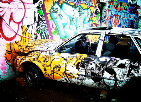
Graffiti!
Despite the number of negative purposes graffiti may serve and how the law tends to treat artists who make graffiti, this form of public art is still very interesting and can effectively disturb the "plain-ness" of a large, blanks wall or other structure into a mural. Graffiti styles vary from area to area, and graffiti itself is most often found in large cities. Often times the messages of graffiti are either gang related or reflect on the challenges an area poses upon its inhabitants. In other cases, some people just get crazy with a spray can and start making all sorts of cryptic looking symbols and images.I myself have encountered a very large amount of graffiti in Atlanta, most of it coats older buildings, bridges and retainment walls (going towards Little Five Points, graffiti becomes much more common).


Thursday, October 14, 2010
"Mona Lisa of the Depression"
In Mitchell's text, he refers to an image of a woman as the "Mona Lisa of the Depression". I found this to be very interesting,the effect of combined tranquil and worn features of her appearance displaying a 1920's version of the Mona Lisa. Regarding the section in which this image is found, I also now understand how having images with no text regarding their content could be received as being more powerful and meaningful for a spectator than an image that has its context accompanied by a caption of any sort. When a photo is isolated from any text, it allows a viewer to come to their own conclusions of what is occurring, with no mental strings or attachments to misconstrue or add content to the original image.
After reading Mitchell's piece, I was also reminded of a personal favorite regarding Depression-era images that I would like to share (and that you have probably already seen).

After reading Mitchell's piece, I was also reminded of a personal favorite regarding Depression-era images that I would like to share (and that you have probably already seen).

Tuesday, October 12, 2010
I'm hungry, but I want more than just a meal...
 | ||
| Quite probably the best burger in Atlanta, hands down. |
Despite my current lifestyle being that of your typical college ragamuffin, every now and then I prefer for my food to give me a good reason to eat it as opposed to simply inhaling anything that is placed in front of me.
 |
| It's not that you're gross, it's just that... okay yeah, it is. |
There are many ways to do this, such as my meal literally just smelling so good that I can't resist eating or having decent atmosphere that I can enjoy while eating. Together, however, these two techniques can make a meal an experience are very enjoyable. When a restaurant goes out of its way to make its interior appealing to customers, the aesthetic value of the eatery provides vast amount of entertainment for people and helps make a meal something more than an act of fuel consumption.
One place that truly emphasizes on this use of atmosphere is Atlanta's own Vortex Bar and Grill (Love this place, my ap psych teacher's husband is a manager here). Rather than just having your typical diner, the outside has a giant skull with spinning eyes and blaring music that draws attention to itself. Surrounding the Vortex are many other odd stores and buildings, so perhaps the effect a giant crazy skull would have on passerby's is mildly weakened since it must compete for attention with a number of other buildings that demand just as much attention as itself.
Sunday, October 10, 2010
Bioshock

Almost perfectly modeled for the time period in which is takes place, Bioshock has many similarities with the 1960's style of buildings. Taking place in an upper-class underwater city, the environment is perpetuated by the dark sea surrounding the metropolis, while neon signs and lights flash at the player as they navigate the corrupted city. Posters that are similar in style to those used in wwII are seen plastered all over walls, some covered in smeared writings of rebels and crazed drug users known as "splicers". In terms of sound effects, old radio songs can be heard almost constantly throughout the game, such as whenever a player visits a shop or passes by a phonograph.
I highly recommend this game to anyone who enjoys first person shooters or extremely thrilling games. The gameplay is highly customizable, with different powers (called plasmids) and weapons that can be upgraded throughout the game. The storyline is equally interesting, and has spawned many groups that debate over what certain symbols and meanings are within the game.
A warning: Bioshock is EXTREMELY graphic and contains some disturbing content matter (but for the brave, it is wicked interesting).
http://www.youtube.com/watch?v=Lmw78t8NgIE&feature=related
Thursday, October 7, 2010
Public Art: fountains
Fountains are probably the most serene form of public art I can think of. The white noise of rushing water coupled with the appearance of water temporarily defying gravity is often mystifying to all viewers. Fountains are often purely aesthetic, lacking any deeper meanings or political messages. One idea often associated with the owning of a fountain is wealth, being that fountains are difficult and costly to maintain.
 |
| Maryland Government House- Victorian fountain |
Monday, October 4, 2010
Portal 2
As with another post I have made, I oftentimes consider the video game industry to be an art. As with paintings that are reproduced or take too much inspiration from one another, there are many games in today's industry that copy too much from one another and therefore bog down the market with look-alike, play-alike, feel-alike games that leave players devoid of a memorable experience and a gaping $60 hole in their pockets.
One company that has refused to take $60 without a fair trade has been a group known as Valve. Valve, once an offshoot of a small Microsoft company, now produces video games full-time. A common theme between most Valve games is a lack of cut-scenes, first-person viewing style, and a storyline that often has much more than meets the eye.
An example of this type of game would be Portal 2, a puzzle game in which players must survive rigorous and usually mind-bending tests provided by an extinct corporation called Aperture Sciences. Though dead in biological terms, the company's artificial shell still thrives and is still testing new products constantly. This link shows one of the assumed products, a robot that is capable of solving puzzles offered up by the long dead group. Better stated, these mechanisms can "Think with Portals".
http://www.youtube.com/watch?v=A88YiZdXugA&feature=channel
Consistent with the stereotypical post-apocalyptic scene, Portal 2 has an environment of decimated technology coated in undergrowth, with no human life other than the gamer. The colors gray, black and white are the most commonly seen colors, each granting a feeling of overall lifelessness to the game.
---For the record, I can beat the original Portal in about 50 minutes and am desperately seeking someone who wants a partner for the "cooperative testing initiative". If anyone reads this and wants to get together once this game comes out (Sometime next November, if I recall correctly) please leave a comment or send a message about that.
Sunday, September 26, 2010
Beautiful over youtube, better in concert
Dublin Philharmonic: Dvorak's New World Symphony, 1st Movement
Dvorak's New World Symphony is a very long but incredibly moving piece that was made during the nineteenth century. The work has numerous solos and changes in styles. I enjoy orchestrated music very much, and Dvorak's style of very loud, powerful melodies appeals to me sicne it causes the effect of his pieces to be easier to sense. If any readers like Dvorak's work, I suggest other artists such as Gustav Holst and Hector Berlioz, who also tend to make pieces with easy to grasp melodies.
Dvorak's New World Symphony is a very long but incredibly moving piece that was made during the nineteenth century. The work has numerous solos and changes in styles. I enjoy orchestrated music very much, and Dvorak's style of very loud, powerful melodies appeals to me sicne it causes the effect of his pieces to be easier to sense. If any readers like Dvorak's work, I suggest other artists such as Gustav Holst and Hector Berlioz, who also tend to make pieces with easy to grasp melodies.
Thursday, September 23, 2010
Photography
The invention of the camera allows any moment in time to be visually frozen for eternity. This gift of immortalization, however tempting, is now overused by men; with such great supply of pictures, the demand is low. Photographs, such as the one below, can have a obvious meaning and effect on its audience, but unlike paintings and true works of art, do not send actual emotions to a viewer. The image below would likely shock an audience at the monstrous acts taking place in the death camps in nazi-controlled Europe, but does not give any information or perception on how the creator of the image perceived his subject or his subject's situation.
 |
| Holocaust prisoner at Camp gusen, Austria. |
Thursday, September 16, 2010
Alice gone wrong.
Ever since I was little, Alice in Wonderland has been story of absolutely nightmarish proportions about which I tried my best not to think. Although I've yet to read the novels (They are pretty low on my priorities, unfortunately. I want to read Atlas Shrugged first) the Disney cartoon alone baffles me. A girl goes into a hole chasing a rabbit and finds some world where things make absolutely no sense. Such a clear-cut presence of chaos is something that tends to violate my strong internal locus of control and causes me to feel as if I am unimaginably helpless. I am often left lost in my own muddled thoughts, trying to make sense of what I've witnessed, and am left with some skewed and poorly crafted context that never existed. My rationalities and intellectualizations leave me in a worse state than I was in before mulling over Alice.By my definition of art, Alice in Wonderland is quite the masterpiece. I am left with a changed perception, and have been granted a stimuli that will vex me for hours.
What was once just a cartoon and a novel, however, has seen a change in medium. American McGee, an independent videogame designer, has revolutionized my childhood trauma. The preview for Alice 2 can be found here (watch at your own expense, nothing explicit shown but chilling nevertheless): http://www.youtube.com/watch?v=vV5Wl5FfBEc&feature=player_embedded

What was once just a cartoon and a novel, however, has seen a change in medium. American McGee, an independent videogame designer, has revolutionized my childhood trauma. The preview for Alice 2 can be found here (watch at your own expense, nothing explicit shown but chilling nevertheless): http://www.youtube.com/watch?v=vV5Wl5FfBEc&feature=player_embedded

Wednesday, September 15, 2010
Art: Naturally Occuring
When people think of nature, many things come to mind. Mountains, trees, and fauna would all probably be brought up when talking to a typical person about what nature is. A scholarly person might bring up smaller parts of nature (by smaller, I mean less visible) such as gravity or chemical reactions or cells in an organism. All of these things are natural, but one thing that is often seen as being too abstract to be of nature is art.
Art, which in a past blog post has been defined as a novel stimuli that triggers deeper thought and possibly alters one's perceptions, too abstract for nature? If humans are really a collective mass of chemicals, and we need ways to change some of these chemicals around (see: outlet, release) art is most assuredly natural. It is simply the product of a chemical reaction that influences much more than just a re-combination of atoms.
One thing that is very notable about nature is its stubbornness. If a fish is taken out of water, it dies. If you put me into water, I'll probably try to swim to shore. If I don't make it, I will probably die. If you were to just put an ocean into the middle of a desert, the ocean would flatten out because of gravity and all sorts of chaos would ensue.
So then, since it is not acceptable to mess with nature's rules, why is it okay to remove a painting from its source? If someone took a beautiful tapestry from the High Museum in Atlanta and stuck it in a bathroom, it would probably have much less meaning. If an altar is moved from a church to the moon, it becomes a rock.
By all means, the location of a piece is just about as significant to a work as the context and history of the work itself.
 |
| Something is definitely wrong here. |
Saturday, September 11, 2010
The effect of an aura.
In Walter Benjamin's piece Illuminations, Benjamin discusses the effects a novel stimuli can have on an observer, such as a breathtaking mountain view. This effect is only obtainable from that one point of view, and is what makes the view authentic and adds depth to what is being perceived. One artist, known as Thomas Moran (a likely candidate for an up-and-coming art essay) is known for painting landscapes and images of nature. Although I might be viewing a mere reproduction of his work halfway across the world, his pieces transmit the awe that inspired their creation very well.
Moran has a consistent use of contrasting shades to bring out the depth, magnificence and mysteriousness of whatever scene he is trying to capture. Most of his paintings have large bodies of water that are usually very forceful in appearance, such as this image's waterfall. His paintings are often set at a long distance, allowing his pictures to contain several elements that add to the work's overall effect on an exhibitor.

Moran has a consistent use of contrasting shades to bring out the depth, magnificence and mysteriousness of whatever scene he is trying to capture. Most of his paintings have large bodies of water that are usually very forceful in appearance, such as this image's waterfall. His paintings are often set at a long distance, allowing his pictures to contain several elements that add to the work's overall effect on an exhibitor.

Monday, September 6, 2010
Trying to interpret a piece.
 |
| "Home for Blue Jays", by Rebecca Richman |
I chose Home for Blue Jays for this post because of some of the schema it revolves around. The colors are kept light and crisp, to reflect the wintry state of this image. Darker colors would likely not reflect a proper habitat for a Blue Jay, given that darker colors would probably involve a nighttime setting (when birds tend to sleep). Also, the color scheme is kept very simple, like those found in nature. Extraneous coloration would often be interpreted as a more bio-diverse landscape, like a rain forest.
To further the idea that the environment pictured by Richman is in Winter, there are snowflakes drawn to the front of the image. Snow only occurs in during colder seasons, and would impress the idea that Bluebirds prefer colder ecosystems amongst an audience.
The landscape is also barren of any predators. A creature with fangs bared, or some beast running off into the forest would represent danger and would not mix well with the idea of an ideal place for Blue Jays. Birds are fleeting in nature, and it is unlikely that they would be seen near anything that could incur a dangerous situation.
Thursday, September 2, 2010
Fractiles
 |
| Batlimore, by Sarah Scotland |
Going along with a recent topic of art that is really too abstract to have meaning, I was reminded of fractiles. Fractiles are images that repeat off into infinity, becoming proportionally smaller over time and usually consist of a number of color themes and shapes. Fractiles tend to be almost hypnotic, and some have themes that cause them to imitate certain things people see in real life. Should any readers of this post be interested, Sarah Scotland (artist who made these two fractiles) has links on her website regarding programs that can be used to make these spellbinding pieces.
"Baltimore" almost looks like a long staircase, something out of a fancy building in a big city. The colors are both very rich in appearance and are not uncommon in higher-end buildings. "Incantio" makes me think of a quick flash of deep inspiration or clarity, as the image appears to be almost window like due to the glare effects on the shapes that surround the descending circles. The idea of this emotion being quick is from the beams of light that appear to be connecting the ripples.
 | |||
| Incantio- http://infinitezoom.com/gallery8/baltimore.htm, by Sarah Scotland |
Monday, August 30, 2010
Art, what is it (Reference to High Museum of Art inside)?

Art is anything that causes a person's regular thinking patterns to change; it is a novel stimuli. That nasty burger in the dining hall, the BMW that just flew past, and an oddly crafted spiral shaped bookshelf are all art. Not all of them are good art, but these pieces are art none the less.
However different our perceptions may be in relations to how we think of art, the art that is best received causes our mental patterns to be relegated the most. A poorly prepared burger may disgust someone while eating, but chances are the sad recipient will not spend hours reflecting on what made the burger so bad, he or she will simply resume regular activities. A nice car will distract a bystander and be ascetically pleasing, leaving this person longing for a vehicle that looked slimmer and more stylish. Like the displeasing burger, the car too shall not be processed in a deep or drawn out manner and is very limited in terms of artistic value.
 Contrasting its rivals, an oddly proportioned bookshelf can be of massive artistic significance. Firstly, an onlooker will probably have no idea what is being displayed. With a closer look, some research, and thought, the viewer will perhaps come to appreciate this arcane work and be left with changed perceptions on what a bookshelf can be. Unlike the nice car and the gross food, the effective art did more than simply disrupt one's routines but left an imprint on a spectator. The concept of a bookshelf, once simply defined as a bunch of sturdy boards nailed together to support books, is now something much different. Rather than providing a momentary shock, this well crafted work has branded the admirer.
In conclusion, art is defiance of the ordinary. Art displaces, and for those who submit to the vast power of art, grants a perspective broadening experience that is transmitted without harm to all subjects.
Thursday, August 26, 2010
Illustration by Jon Foster

This picture is interesting because of how extraordinary the situation it depicts is. I am left wondering as to whether or not the man in the lower right corner knows about the changes taking place in his shadow. If he is not aware, perhaps the shadow is his soul or personality being cast onto the wall by the light, though this does not reveal as to why he is running. If he does know of the grotesque shadow's presence, he is mostly likely running out of fear.
Subscribe to:
Posts (Atom)